- Industry
- Creative
- Site type
- Blog
- Platform
- Webflow
- Tech
- GSAP
- Style
- Editorial, Soft, Minimal, Earthy
- Business model
- E-commerce
- Presence
- Online
- Components
- Navigation Bar, Hero, Feature Card, Primary Button, Carousel, Badge, Scroll Triggered Bottom Navigation, Parallax Image Cards, Dark Gradient Split Cards
- Score
- 49.75/100 · 100% evidence · Review pending
- Typography
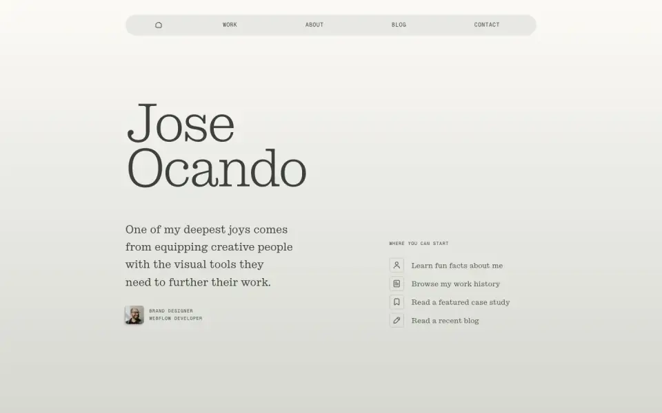
- Display — Stringer; Heading — Stringer; Body — Stringer; Mono — Geist Mono
- Palette
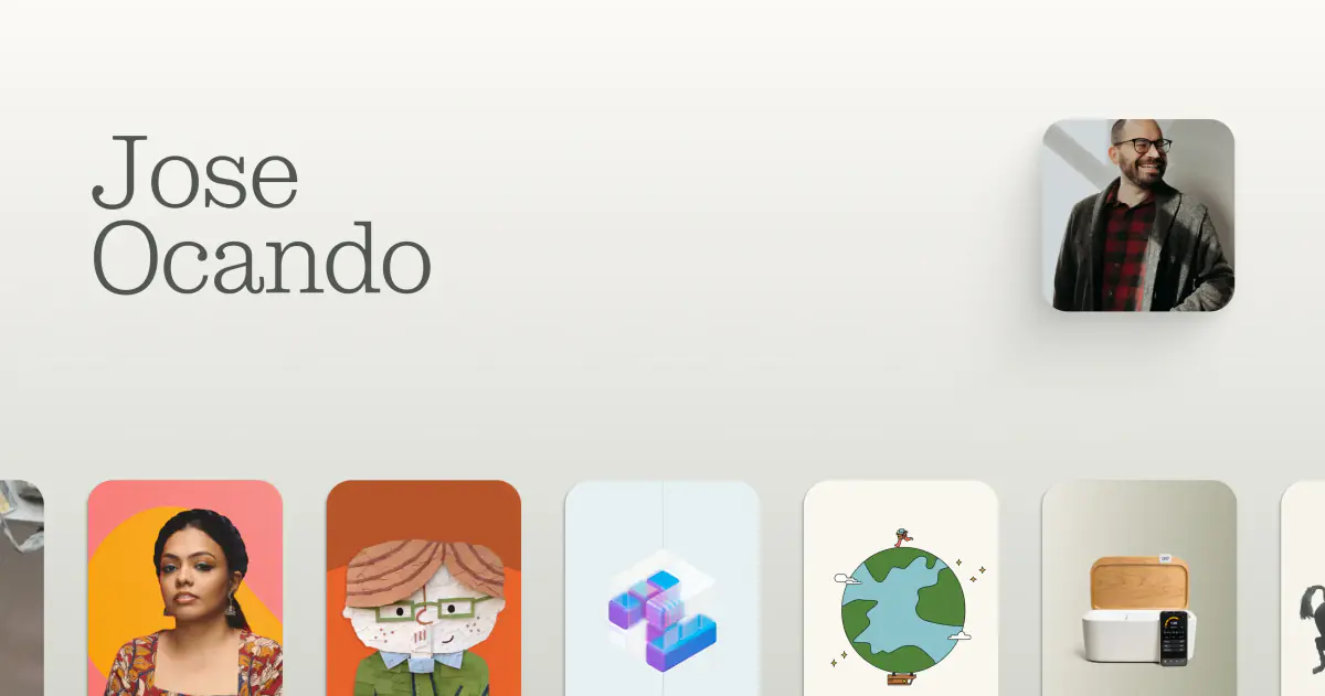
- OG image
Design analysis
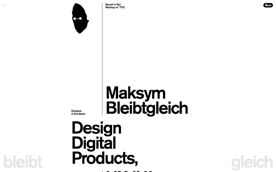
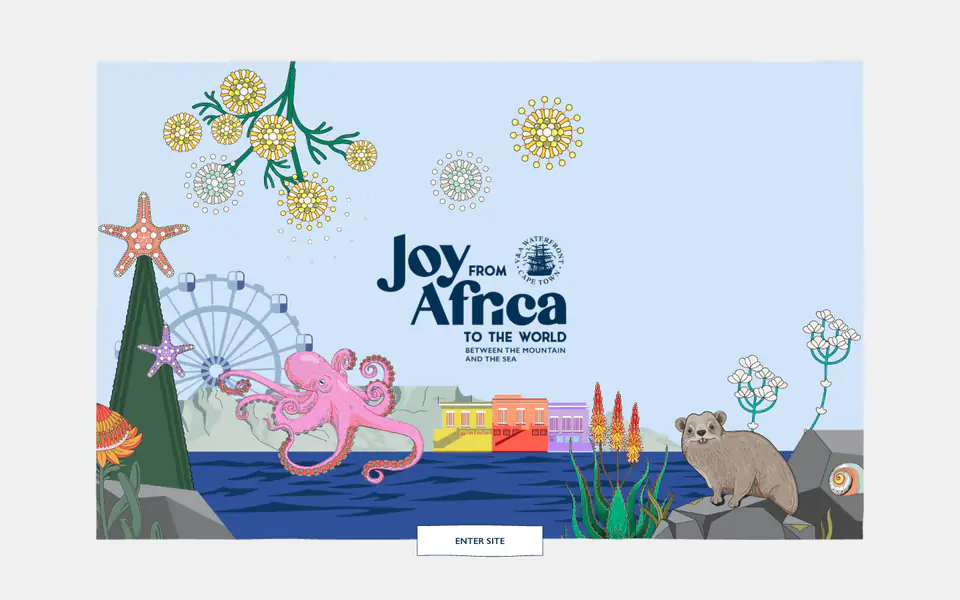
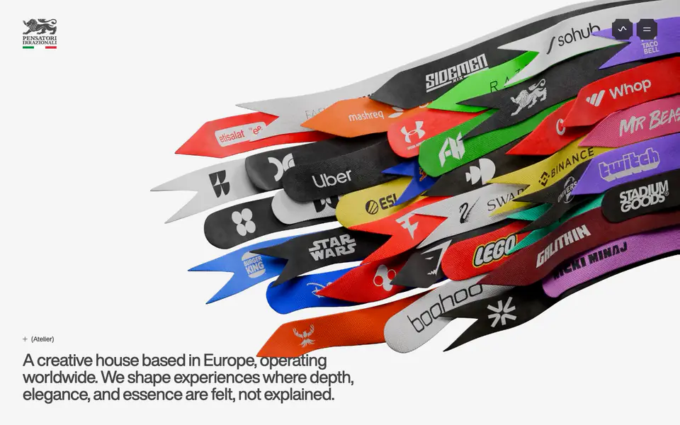
The website features an editorial and soft minimal design characterized by a muted, earthy color palette of greys and greens. It pairs a distinctive, lightweight serif font for display and headings with a geometric mono font for UI elements and smaller details. Layouts utilize generous whitespace and large, rounded feature cards with dark gradient backgrounds to present case studies. Scroll-linked parallax effects on card images add depth, while pill-shaped buttons and floating navigation elements provide a modern, tactile feel.
- Spacing
- Generous vertical rhythm with large margins between sections and substantial padding within feature cards.
- Shape
- Heavily rounded Large border-radius on main feature cards (approx. 20-24px) and fully rounded pill shapes for buttons and the top navigation.
- Borders
- Minimal visible borders; relies mostly on background color contrasts, gradients, and subtle semi-transparent 1px dividers.
- Buttons
- Pill-shaped containers, often with a solid light fill on dark backgrounds or outlined on light backgrounds, featuring uppercase mono text and arrows.
- Width
- Centered main content column with large outer margins, expanding for the full-bleed impact of the feature cards.
- Density
- Low density