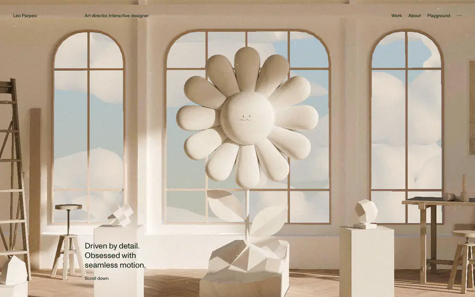
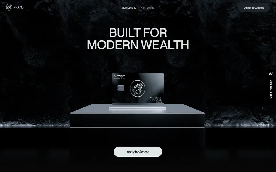
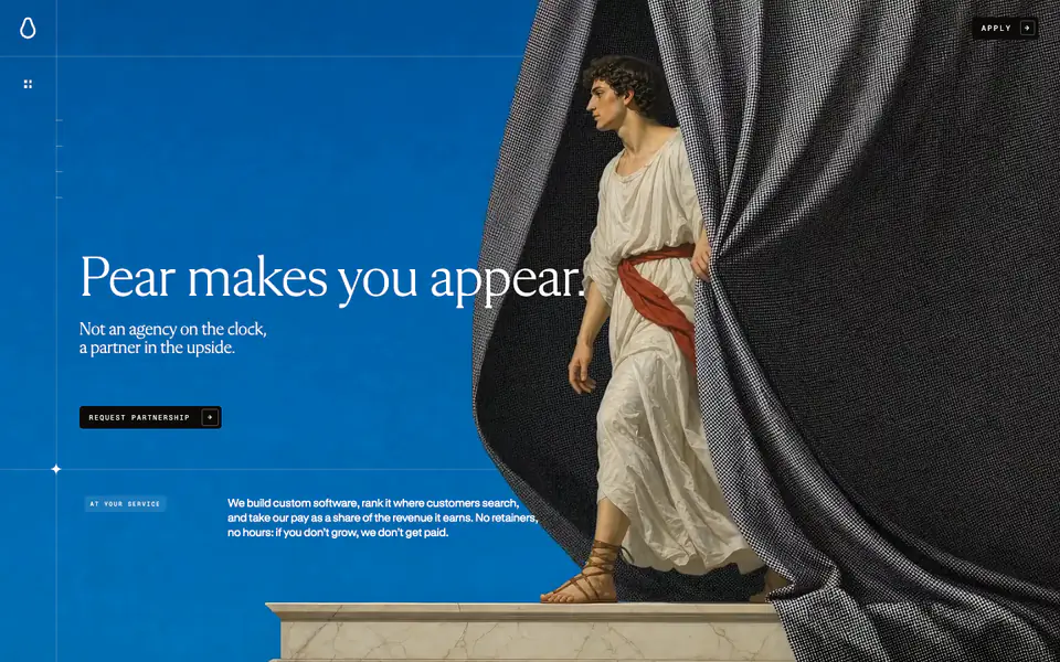
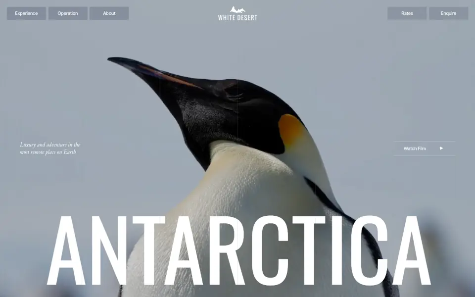
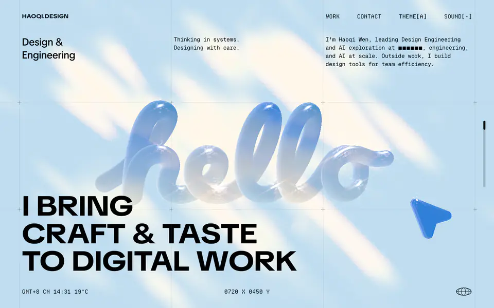
The website is a personal portfolio showcasing a blend of high-quality 3D rendered environments and stark, minimalist typography. The design relies on a light off-white canvas populated by dark, highly contrasted text, often set in very large, bold uppercase display styles. Generous white space and structured alignments define the layout, interspersed with horizontal scrolling project galleries and a detailed list-based archive. A recurring interactive 3D bee element introduces a playful, experimental layer over the otherwise clean, editorial-style interface.
- Spacing
- Generous vertical spacing between distinct sections, with tight, structured padding within the tabular archive list.
- Shape
- Sharp corners on all typographic elements and layout boundaries, contrasting with the soft, organic shapes of the 3D renders. No visible border-radius applied to major layout containers or images; edges are straight and hard.
- Borders
- Virtually non-existent borders; separation is achieved through white space, scale contrast, and subtle background lines in the archive table.
- Buttons
- Interactive elements appear as simple text links (sometimes accompanied by an asterisk or small arrow), avoiding traditional contained button shapes.
- Width
- Variable; 3D scenes and galleries stretch full-bleed across the viewport, while text content is often constrained to specific columns or centered blocks.
- Density
- Low density overall, heavily utilizing negative space to emphasize large typography and detailed 3D imagery, though the archive section presents higher density tabular data.