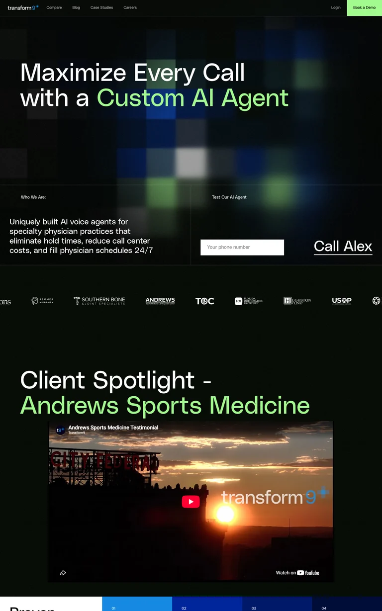
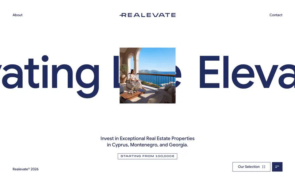
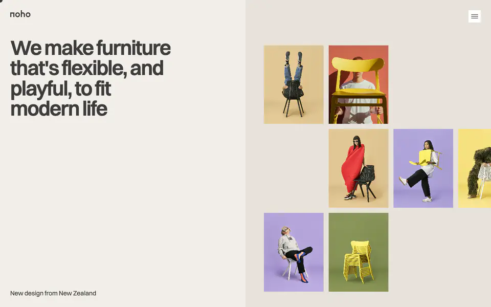
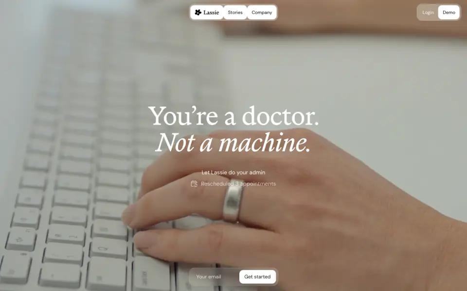
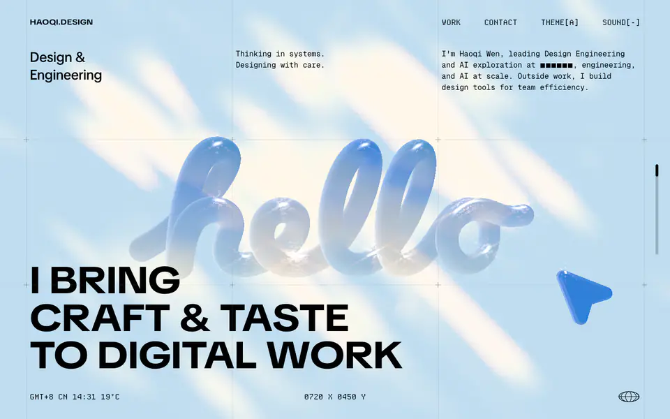
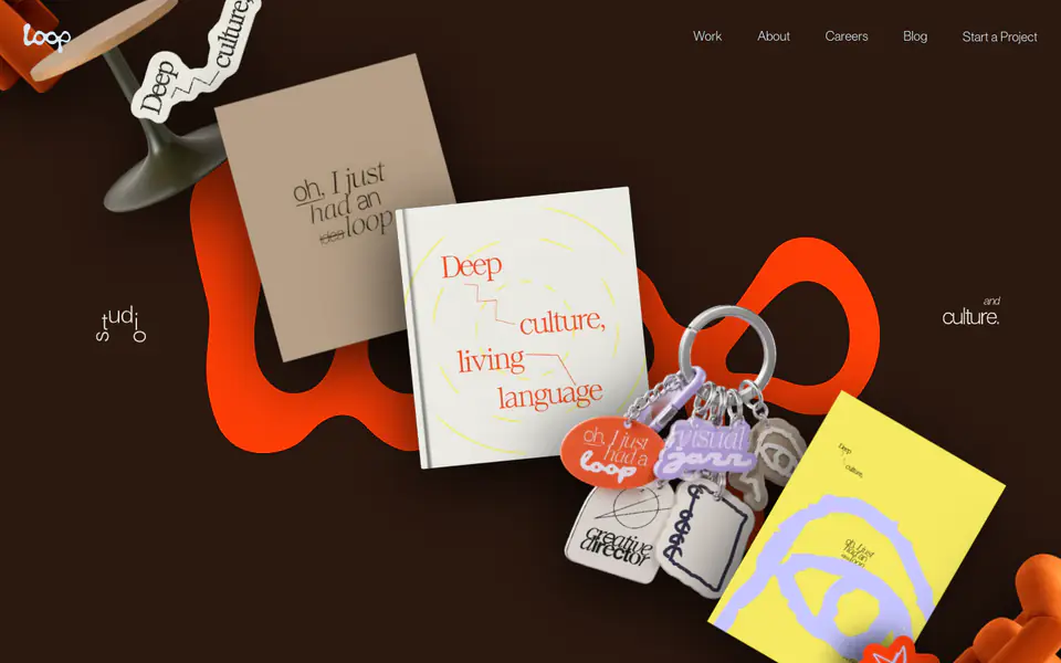
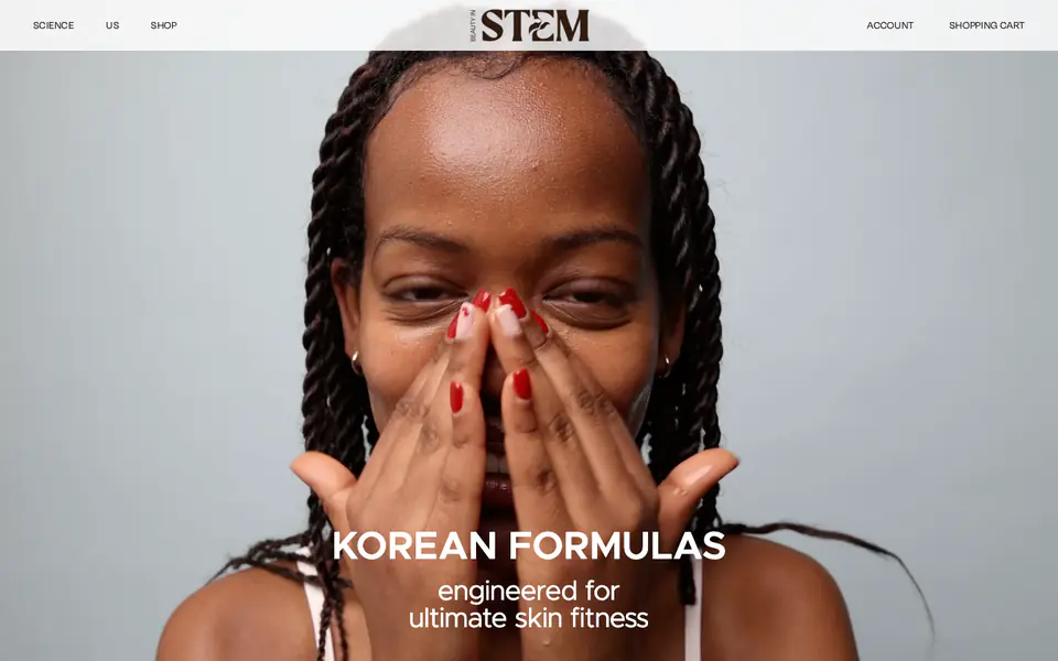
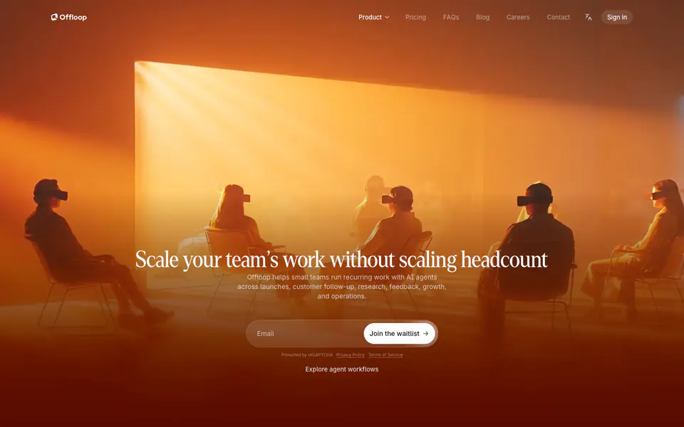
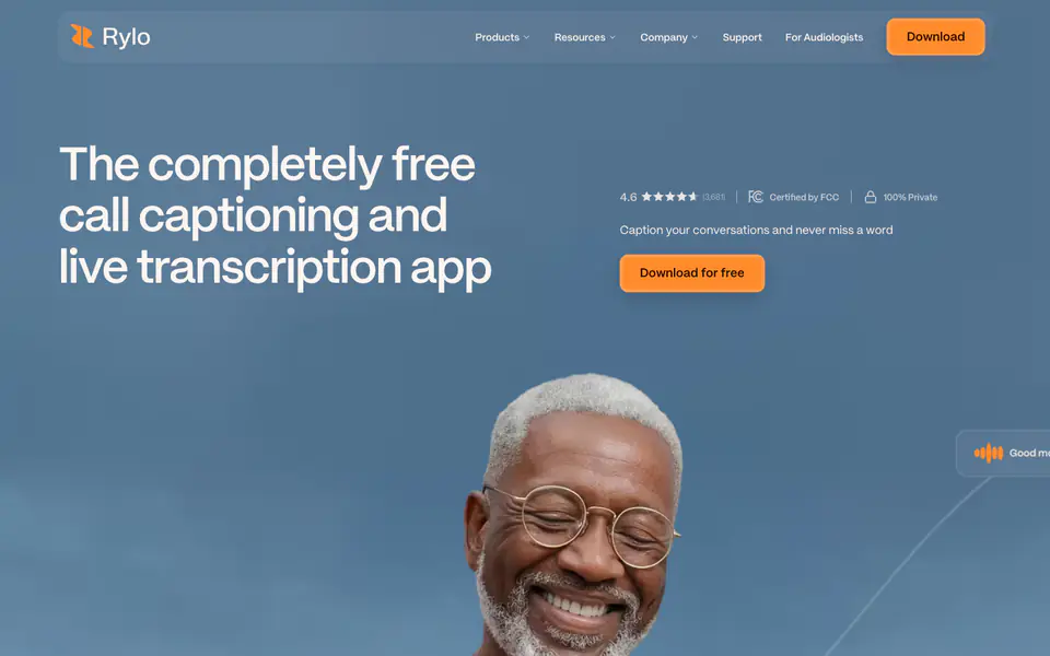
The website features a modern, dark-themed, corporate SaaS design with a focus on bold typography, grid-based layouts separated by thin borders, and high-contrast neon accents (green and blue) to highlight key information. It heavily utilizes mock UI elements to demonstrate product capabilities.
- Spacing
- Generous padding and margin between major sections, relying on a strict horizontal and vertical grid defined by visible borders.
- Shape
- Sharp 0px corners are predominantly used for layout divisions and imagery, while mock UI elements (chats, cards) feature rounded corners (approx 8px-12px). Mixed: 0px for main layout containers, moderate rounding for internal product mockups.
- Borders
- Frequent use of 1px solid, semi-transparent white borders (rgba(255, 255, 255, 0.2)) to delineate sections and create a wireframe/grid aesthetic.
- Buttons
- Solid color fills (e.g., green #A2FA8E) with sharp corners and black text for primary actions.
- Width
- Full width for background elements and borders, with content mostly constrained to a wide, centered column or split into strict 50/50 layouts.
- Density
- Moderate to low density; large text and ample negative space allow the key statistics and UI mockups to stand out clearly.