- Industry
- Travel
- Site type
- Blog, Portfolio
- Platform
- Webflow
- Tech
- GSAP, Three.js
- Style
- Corporate, Gradient, Minimal, Typographic, Data Centric, Glassmorphic Accents
- Business model
- AI, Software, Portfolio
- Presence
- Online
- Components
- Announcement Bar, Navigation Bar, Hero, Logo Strip, Feature Card, Testimonial Card, Stat Block, FAQ Accordion, Primary Button, Footer, UI Abstract Illustration
- Score
- 54.05/100 · 100% evidence · Review pending
- Typography
- Display — TWK Lausanne; Heading — TWK Lausanne; Body — Inter
- Palette
- OG image

Design analysis
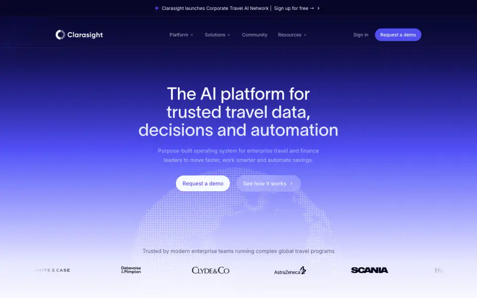
Clarasight's website employs a clean, modern, and corporate design language tailored for an enterprise audience. The visual identity is defined by a deep blue to white gradient, generous whitespace, and sharp sans-serif typography. High-fidelity UI mockups and data visualizations act as the primary imagery, reinforcing the product's focus on analytics and automation. The layout relies on structured grids and rounded cards to organize complex information digestibly.
- Spacing
- Generous vertical rhythm with large paddings separating distinct sections, allowing for clear visual hierarchy and focus on interactive elements.
- Shape
- Consistently rounded corners across all container elements, creating a soft, approachable interface. Pill-shaped (fully rounded) buttons; medium-to-large border radii on feature cards and UI mockups.
- Borders
- Subtle, low-opacity solid borders primarily used to demarcate cards and separate the footer from main content.
- Buttons
- Solid fill primary buttons with contrasting text, and semi-transparent or outline secondary buttons, all featuring pill-shaped radii.
- Width
- Centered content constrained to a readable max-width, leaving substantial margins on wider desktop viewports.
- Density
- Low density; abundant whitespace is used deliberately to highlight key metrics, typography, and specific UI illustrations without overwhelming the user.