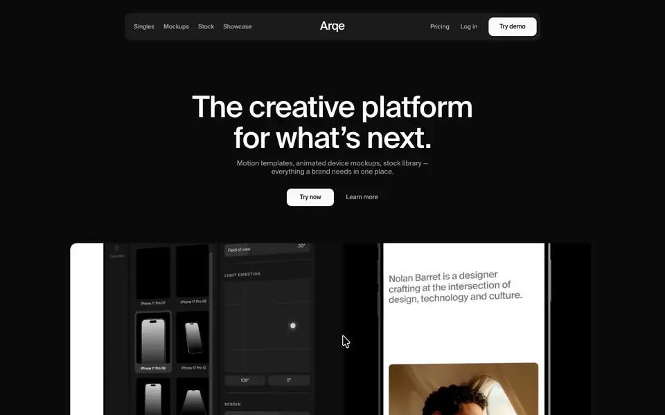
The Papermark website employs a highly sophisticated, minimal and corporate design language characterized by high-contrast dark and light sections, oversized typography, and clean, structured data visualization. It makes extensive use of product UI mockups and large statistic blocks to convey value, framed by generous whitespace and subtle borders.
- Spacing
- Generous vertical padding between sections (often hundreds of pixels) to ensure strong separation and breathing room.
- Shape
- Subtle rounding on interface elements like buttons, mockups, and feature cards, contrasting with straight-edged layout boundaries. Small to medium border radii (e.g., 4px-8px for small UI elements, larger for main image containers).
- Borders
- Thin, low-contrast borders (e.g., #E5E7EB on light, rgba(255,255,255,0.06) on dark) used sparingly to separate list items or enclose cards.
- Buttons
- Solid fill primary buttons with high contrast text, and subtle outline buttons for secondary actions.
- Width
- Wide max-width constraint for main content, often spanning horizontally but keeping text blocks readable.
- Density
- Spacious and comfortable, relying heavily on negative space to draw attention to typography and data points.