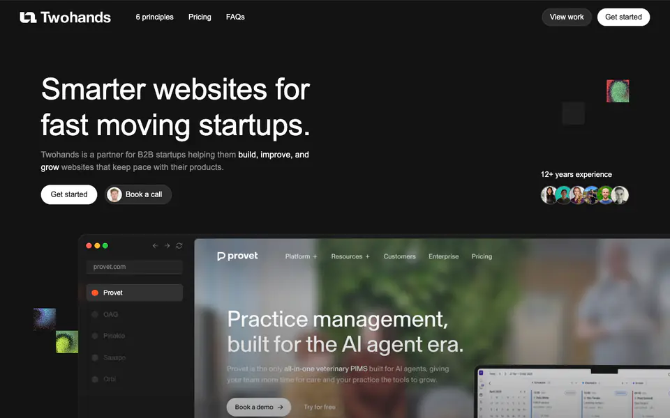
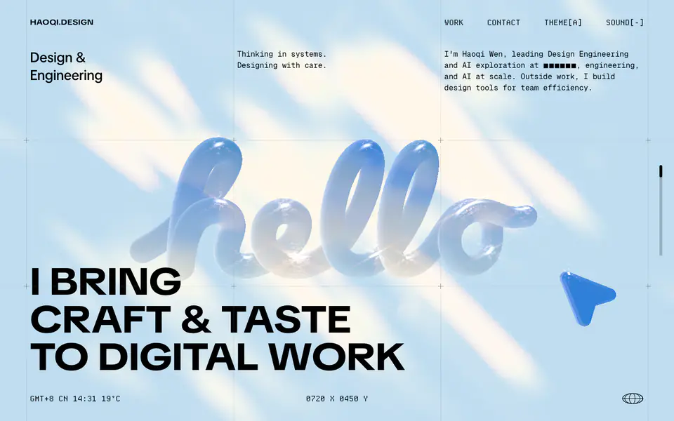
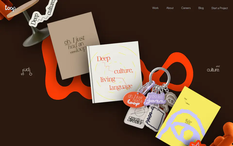
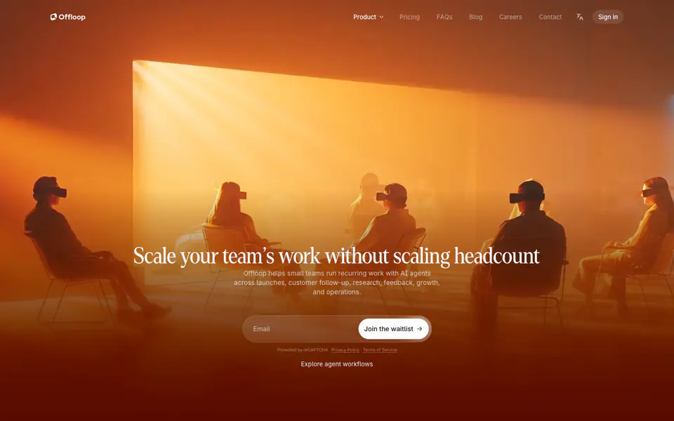
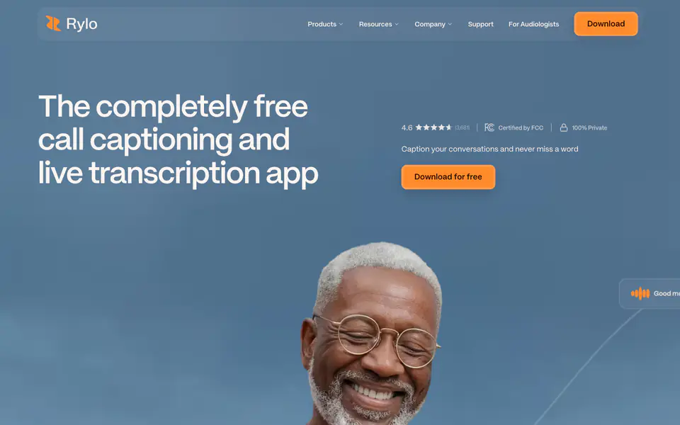
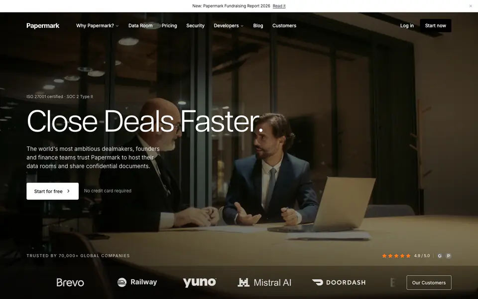
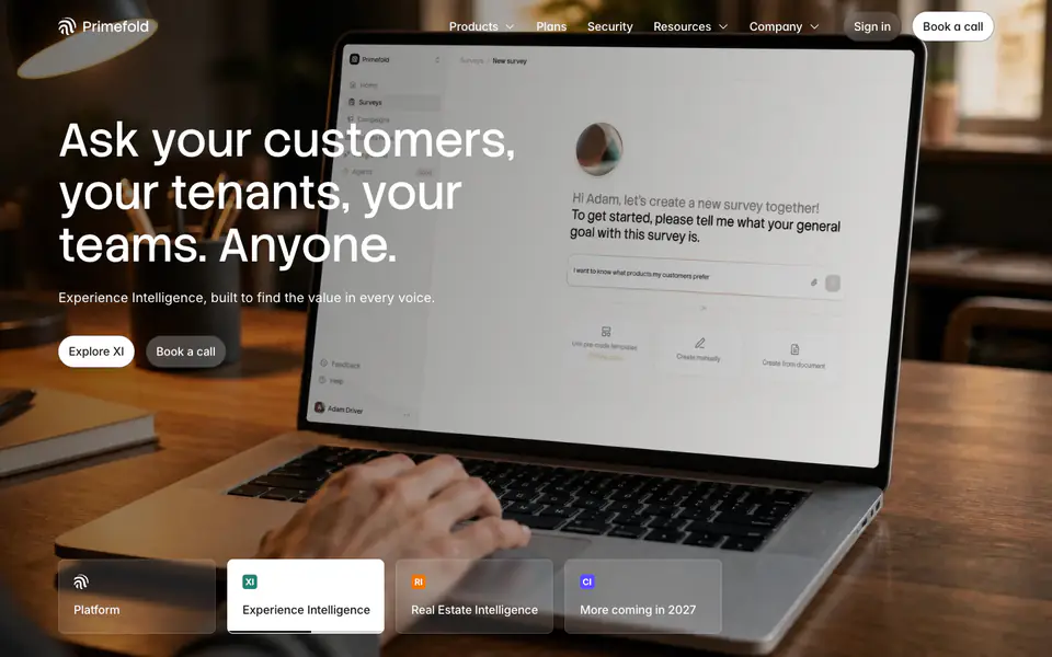
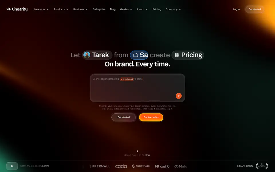
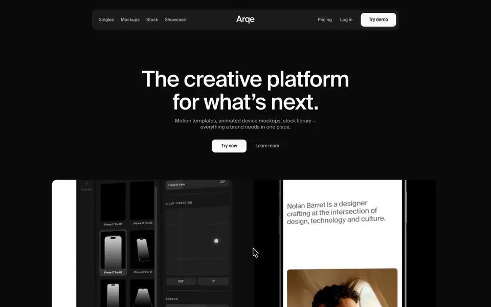
The website presents a minimal, dark-themed editorial design for a B2B design and development service. It utilizes a single typeface family (Geist) across all scales, set against a dark canvas with subtle glowing or textured accents. The layout employs a strict grid with fine borders to demarcate sections and cards, creating a highly structured, technical aesthetic. Key interactive elements like buttons use fully rounded pill shapes, contrasting with the sharp rectangular grid of the content areas.
- Spacing
- Content is structured using a prominent baseline or vertical grid, visibly marked by subtle horizontal and vertical lines defining sections and cards.
- Shape
- Primary interactive elements (buttons, search-like inputs) use fully rounded pill shapes, contrasting with the mostly sharp or slightly rounded corners of layout containers. Buttons utilize maximum border-radius (pill shape), while feature cards and images have smaller, subtle border radii (e.g., 8px-16px).
- Borders
- Extensive use of 1px solid borders with low opacity (color-14, color-23) to delineate structural grids and card boundaries.
- Buttons
- Pill-shaped, usually solid white (color-2) for primary actions or outlined/translucent for secondary actions, often featuring a distinct hover state or icon.
- Width
- Content is generally constrained within a wide max-width container, centered on the page, with elements adhering to internal grid columns.
- Density
- Moderate density. Generous whitespace is used around major typography and between sections, while complex UI mockups contain higher information density.