- Industry
- Technology
- Site type
- Portfolio
- Platform
- Webflow
- Tech
- GSAP
- Style
- Minimal, Corporate, Typographic, Soft Saas
- Business model
- AI, Software, Portfolio
- Presence
- Online
- Components
- Announcement Bar, Navigation Bar, Hero, Logo Strip, Feature Collection, Testimonial Card, Primary Button, Tabs, Footer, Scroll Linked Text Highlighter, App Icon Grid
- Score
- 52.75/100 · 100% evidence · Review pending
- Typography
- Display — Season Auctordisplay; Heading — Season Auctordisplay; Body — Skandiasn
- Palette
- OG image

Design analysis
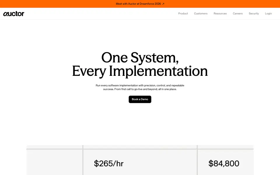
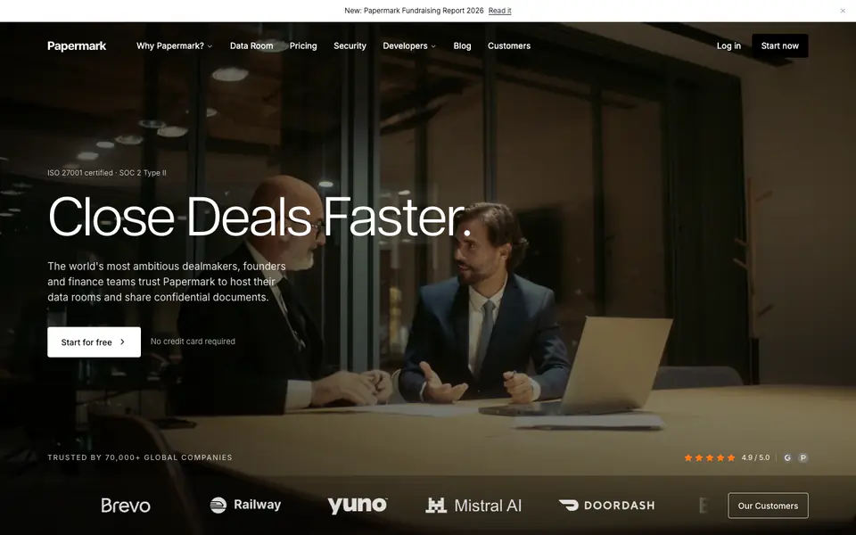
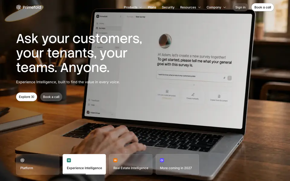
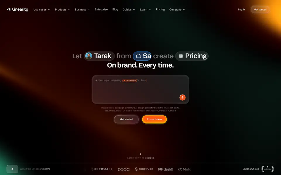
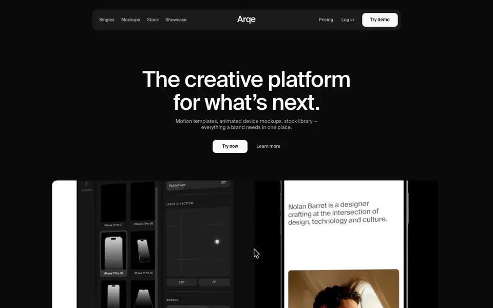
The website presents a minimal and corporate design, heavily relying on whitespace and precise typography to convey a professional tool for software implementations. It pairs a sophisticated serif typeface for headings with a clean sans-serif for body copy. The color palette is primarily neutral (black, white, and light gray) with subtle pastel accents (light green, blue) used to distinguish sections or feature blocks. The layout is spacious and structured, utilizing distinct horizontal bands for different content areas, including a prominent logo strip and a dark footer.
- Spacing
- Generous vertical spacing (macro-whitespace) between discrete sections to control pacing, paired with tighter padding within text blocks and cards.
- Shape
- Consistent use of rounded corners on interactive elements and container modules. Small to medium border radii (likely 6px to 12px) applied to buttons, feature cards, and UI mockups.
- Borders
- Borders are largely absent; the design relies on background color shifts and spacing to define sections, with faint structural lines occasionally used.
- Buttons
- Solid fill (mostly black), fully rounded (pill-shaped) for main CTAs, with high-contrast text.
- Width
- Content is generally constrained to a centered maximum width, leaving wide margins on larger desktop viewports.
- Density
- Low density, utilizing a lot of negative space to draw focus to specific typographic statements or imagery.