- Industry
- Technology
- Site type
- Blog, Landing
- Platform
- Custom code
- Tech
- Next.js
- Style
- Minimal, Soft, Typographic, Corporate, Sophisticated
- Business model
- AI, Software
- Presence
- Online
- Components
- Navigation Bar, Hero, Product UI, Logo Strip, Feature Card, Testimonial Card, Stat Block, Footer, Toggle Switch
- Score
- 57.25/100 · 100% evidence · Review pending
- Typography
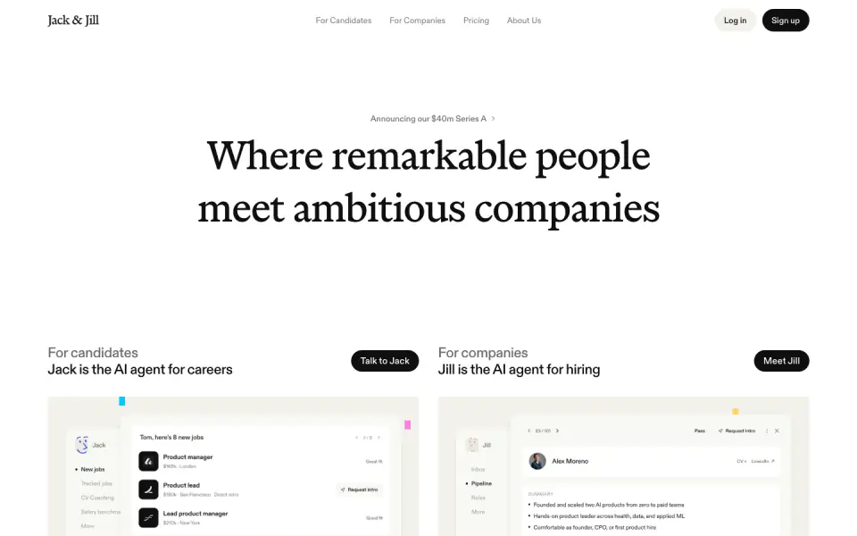
- Display — marist; Heading — diatype; Body — diatype
- Palette
- OG image

Design analysis
The Jack & Jill landing page features a refined, minimal design language characterized by a warm, soft color palette and a strong typographic hierarchy. It pairs an elegant serif (Marist) with a modern sans-serif (Diatype) to create a sophisticated, editorial feel. The layout is structured around generous whitespace, pill-shaped UI elements, and scroll-triggered product demonstrations that guide the user through the platform's value proposition.
- Spacing
- Generous vertical and horizontal spacing, relying on large whitespace margins to separate distinct thematic sections.
- Shape
- Consistent use of rounded corners (pill shapes for buttons and toggles, rounded rectangles for product mockups and imagery). Large border radii on interactive elements and medium radii on content containers.
- Borders
- Minimal use of visible borders; relies mostly on soft background color contrast or very light 1px lines (#EBE9E1).
- Buttons
- Pill-shaped containers. Primary buttons are solid dark (#100F0F) with white text; secondary/toggle states use soft backgrounds.
- Width
- Content is generally centered and constrained to a readable maximum width, with some elements like the logo ticker spanning wider.
- Density
- Low density. The layout is open and breathable, focusing attention on a few key elements per viewport.